
Wednesday, 19 December 2012
Monday, 17 December 2012

Time Management Update
Today we are going to finish work on editing. I have managed to gather a lot of print research as revision notes for when we start work on designing our own digipak. I have also started to think about the design of our digipaks and have started brainstorming ideas. However editing has been taking up a lot of the month which has been slowing down the production because we have been unfamiliar with the technology which all a part of the learning progress.
Designing a Digipak: Digipak Analysis 3


Wednesday, 12 December 2012
Designing a Digipak: Digipak Analysis 2


Designing a Digipak: Digipak Anaylsis 1


Monday, 10 December 2012
Designing a Digipak: Print Research 3


Desgining a Digipak: Print Research 2


Monday, 3 December 2012
Designing a Digipak: Print Research 1


Time Management Update
Today we have managed to film a few more scenes based on the lip-synching sections of our storyboards. Although I have been filmed all throughout the shoot so far, Toby is now the star of this section while I acted as cameraman.
Monday, 26 November 2012
Time Management Update
We've managed to obtain the lyrics from the band which will be used for lip syncing footage later in the week. Today we have started editing, we will be considering the following options
1. Close- ups for Promotion of the artist such as hands on the guitar.
2. Controlled use of Camera, mockery tripod shots, rather than handheld.
3. Variety of shot types such as over the shoulder shots, close ups, and extreme long shots for scenes focusing on the locations, particularly in relation to performance to add interest.
4. Mise-en-scene, costumes, props, etc... are needed to make the video more believable. For example, we have been using an old farmers costume for the main character to make him stand out from the rest of the crowd. We have also been shooting on location throughout the town of Ludlow and throughout the college using props and instruments provided by myself and the college.
5. We will make sure that the meaning is clear by showing a rough cut to a focus group to make sure the audience understands the narrative within the video. This is to be arranged by using feedback by email or Facebook or in person.
6. We will also be taking advantage of straight cuts rather than complicated transmission effects such as coloured filters or cheque board edits to stay in line with a music video genre.
7. We will be aiming to use 40-50 editing shots every minute and the need to match the beat of the song.
8. Our Lip-sycnhing effects need to be spot on and in order to do this we have asked Tom to help be our vocalist.
We hope to wrap up filming our video by the end of the week.
Lyrics
Lyrics for moon from CPugh2005
Here are the lyrics for our featured song, "Moon" obtained directly from the band Fight the Bear.
Wednesday, 21 November 2012
Time Management Update

Monday, 19 November 2012
Filming: Location Shots
Today, Toby has gone around the locations where we have been filming again to take photos fro use as potentionial covers for our upcoming digipak and also to be used during the editing process to make sure that we have managed to capture all of the petentional of using these locations to film.
 These benches have been used for the scenes when our main characther is relaxing on one of the benches and staring into the sky wondering about life outside of earth and of how boring our planet is. The reason why we have chosen this location to shoot this scene is because this area is meant to be influenced by the cold realistic background settings of the Fluorescent Adolescent song I researched a while ago. The main influences from the video that I have used is the fact that we chose a cold damp day to film the outdoor scenes to define the intentionally- boring tone of the first act of the video.
 These dark Ludlow town alleyways were ideal for shooting scenes consisting of the main characther walking up and down the alleyway while thinking about his life. It's been often repeated throughout the fim-making process that shadows can create atmosphere if used do define character and locations. In the case of our video, the shadows are meant to reflect the mood of our character as he is thinking about what to do with his life.
 Our video is going to start off inside the Ludlow College refectory where our main characther is watching tv, reading a magazine and drinking beer. We were originally going to use a pub, but due to time and one of our group members leaving we had to cut back on some of our ideas. This scene was difficult to get right as the tone we were trying to go with, which was a gloomy dark-lit atmosphere that were hoping to go with if we had shot the scenes in the bar were downplayed by the refectories brightly yellow colour and the fact that we couldn't turn the TV off due to a group of students wanting to watch it which made it hard for myself to focus on my tasks.
 These two outdoor locations are going to be used in the scene where our main character manages to find the blueprints of a spaceship in his bag and runs off to his house to build the ship. These locations were shot in a more brighter side of the town located next to the castle to emphasise the change in tone from gloomy and dreary to bright and quirky when he finds the blueprint papers.


Filming: Production Offically Begins!
I am proud to announce that filming has officially begun on our music video! So far we have been filming for a week starting on 12th November and have managed to film the opening sequence of the storyboard where our main character is walking down the street, sitting down on a bench, getting the ideas for building his spaceship and starting to build it in his backyard on Monday.
On Wendesday 14th , we managed to film several shots of our paper spaceship landing on the moon against a 50 foot black background provided by myself. This will be the only scene where me and Toby will not be on the set.
Today on Monday 19th we have filmed footage of myself playing the guitar during the sequence where the video cuts to the band playing our featured song "Moon"

 In two days time, on 21st November, we will start working on our preformance which will consist of not only me and Toby playing instruments, but will also feature sevarel other people that Toby has persuaded to stand in as extras and other band members during the musical preformance of our band.
The deadline is this Friday so wish us luck to get this finished and ready for editing.
In two days time, on 21st November, we will start working on our preformance which will consist of not only me and Toby playing instruments, but will also feature sevarel other people that Toby has persuaded to stand in as extras and other band members during the musical preformance of our band.
The deadline is this Friday so wish us luck to get this finished and ready for editing.


Monday, 12 November 2012
Research and Planning: Storyboard Sequence
This video consists rough paper sketched storyboard of our initial presentation of our video, which has been kindly provided by Toby Wylde.
Wednesday, 7 November 2012
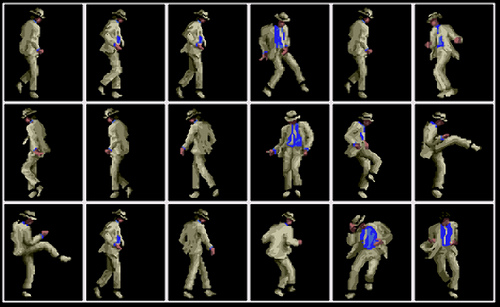
Research & Planning: Choreography/movements and blocking
Here are several images and videos of the choreography and dance movements that we have been researching for further use in our upcoming dancing sequences.
 The moonwalking sequence for example, will be used when our main characther lands on the moon and gets out of his homemade ship by moonwalking backwards in several close up shots. While he is dancing he goes past the american flag and moves it upright again after he finds it slighty bent. The reason why this dance move will be used is that since the song is called "Moon" and our story is going to take place mostly on the moon, it will only make sense that our dance moves should be related to the moon. Since one of the leading interests in media and film is science fiction, it would also make sense for the plot to involve going to the moon.
 During the plot point in the storyboard when the rocket is flying towards the moon, I will be filmed playing a guitar solo against the space background (provided by myself). Although I am also going to be playing when the whole band starts to play, the solo will ampilfy the mood while the rocket flies towards the moon and it provide our viewing audience with a cool and entertaining scene before we get to the moon.
 Here are several images and videos of the choreography and dance movements that we have been researching for further use in our upcoming dancing sequences.


Thursday, 1 November 2012
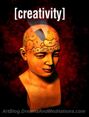
Research & Planning: Post on Creativity
1. Creativity is the ability to design something new using your imagination skills. the term often refers to a richness of ideas and originality of thinking. According to Albert Einstein “Creativity is seeing what everyone else has seen, and thinking what no one else has thought.”
 2. Although I have been trying to be as creative as possible by using both powerpoint and word to present my blog posts and throughout my pitch I have come up with some interesting ideas about how my group could present and film our video such as working out that since the song is called Moon, it should be set on the moon in space which works as the challenge of how to visually represent it, I could improve my creative level by trying out other programs such as Prezi to present any future ideas, I could redesign the layout of my blogs to give them more of a stylish presentation and I could research a wider range of different music videos, films, etc. to get ideas from the designs, the choreography and the editing techinques used.
 3. Nobody knows where creativity comes from, but that doesn't stop people from trying to gain answers. According to Loris Malaguzzi, "Creativity seems to emerge from multiple experiences, coupled with a well-supported development of personal resources, including a sense of freedom to venture beyond the known." So, where does creativity come from? Well I don’t know but one thing is absolutely certain, it is a magical thing.
 4. The main goal of creativity, is to gain an audience and to try and come up with something orginal and different to get them interested into the stories told and the visuals experienced. For example,you need to create a good storyboard, prepare props and costumes, recored the score and think carefully about location shots. Equally the use of lighting and editing is vital to the creative process to create a sense of magic.
 Creativity depends on people taking chances,and even if they don't know, they will try to have an attempt. They should not be frightened of being wrong, which is not the same as being crazy by the way, but if they are not prepared to be wrong, you will never come up with anything original. If not, they could lose the capacity to think originally as they become older.
 Creativity is diverse, we think about the world as we experience it. We think visually, we think in sound, we think in kenetics, we think in abstract terms, we think in movement, secondly creativity is dynamic, if you look at the interactions of the human brain, intelligence is wonderfully interactive. The brain is divided in compartments. In fact creativity which I define as of having orginal ideas that have value more often than not which comes from the interaction of different disciplinary ways of seeing things.
 I definitely agree with the need to be creative as I firmly believe that you cannot stay with the same formula for too long. You need to keep your ideas fresh and try to deliver a stunning visual experience, while keeping your audence interested and entertained at the same time.
 After watching the Howcast video about being creative, I agree that I need to get more sleep while trying to come up with ideas about my music video or any other media-realeted projects I may do in the future as I only get about 6-7 hours sleep in the night. When stuck with a project during a college holiday or weekend, I usally do my own stuff in the day and do my work at night which helps to keep my mind alive with new ideas.


Wednesday, 24 October 2012
Research & Planning: Feedback From Pitch


Our critical reaction to our pitch has been mixed, but we think we can achieve it with the right amount of resources. For example, the moon effects are going to be achieved by using 2d images printed from the internet for not only the moon, but also for the effects of the rocket taking off, moving through space and landing. The Space background has been provided by myself, using a 50 foot background sheet with printed stars and planets already on it. To make the stars more believable, I am going to use fairy lights placed behind the material to create the illusion of shining glowing stars.
Monday, 22 October 2012
Research & Planning: Risk Assessment


Research & Planning: Time Management


Subscribe to:
Comments (Atom)